How to design a landing page that meets your objectives

To start, let’s define what we’re going to be discussing in this article: the landing page. This article will help you design your landing page in the best possible way, so that you can convert your visitors into customers.
How to build a landing page?
A landing page is a web page that aims to encourage a visitor to take an action. In general, this type of page is effective when a single, simple action is performed – for example, a single click of a button. In this way, a landing page meets a clear and simple objective.
So far, it would appear that creating a landing page isn’t complicated. Well, almost… A landing page will pay off, provided you know full-well who you’re engaging with. You need to know your target precisely: their profile, their expectations and their needs. Without this knowledge, it will be difficult to build an effective landing page.
Let’s get to the heart of the matter and detail some of the different processes that go into developing a quality landing page.
We’ll develop this subject around 3 strategic elements:
- Understanding the main principles of a landing page.
- Common mistakes that impact conversion.
- The steps to follow when creating a quality landing page.
The main principles of a landing page
This is the classic scenario that a landing page involves:
- Step n°1: The visitor goes to the page.
- Step n°2: The visitor performs an action on the page.
In order for the visitor to go from Step 1 to Step 2, you need two things:
Traffic:
Creating a page is easy. However, the very essence of a page’s existence is to provide content that will not only address the concerns or requirements of visitors, but will captivate them too. Captivating attention on your page involves delivering quality content that effectively covers a given topic. In short, you need to offer content that’s adapted to the users who will be visiting the landing page.
A Call to Action (CTA):
A CTA is essentially a button that asks to be pressed. The page in question should systematically trigger a specific action from users. Without a button prompting the visitor to take an action, your landing page has no real reason to exist, because it will quickly be forgotten by a user, who will navigate from page to page on the web. Your page must stand out, and above all make it want to perform an action that you can trace, record and analyze.
Traffic and CTAs are fundamental elements of a landing page. Of course, the layout of pages may vary depending on your product(s) and your goal. There are several well-known approaches to use, such as:
The AIDA Model
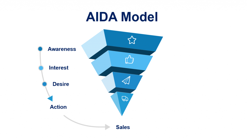
The AIDA model was created by an American strategist
Attention -> Interest -> Desire -> Action
The AIDA model is a tool that divides a buyer’s journey into 4 parts. It is about moving the buyer forward through this funnel:
- A for Attention: capture the attention of the buyer.
- I for Interest: arouse their interest.
- D for Desire: make them want; the desire to buy.
- A for Action: and finally, facilitate their passage to the purchase, to the action.
The PMPHS model
Pain -> More Pain -> Hope -> Solution
Let’s say you have demonstrated to your visitor that you have correctly identified their problem. You then amplify their problem. At this point, you instil in them the hope of having a possible way out of this problem, and you end by offering them a solution: your solution.
These templates can help build the framework for a landing page and establish the scenario that users will progress through.
Common mistakes when designing a landing page
Let’s take a look at a list of common mistakes that could cause users to leave your page without taking the desired action:
- An opaque offer: as you re-read the text on your page – with hindsight and out loud – you may realize that it doesn’t clearly explain the message you want to convey.
- Hard-to-find CTA button: Make sure the CTA is visible and easy to find. If visitors don’t click enough, it’s likely because the button isn’t that visible.
- Long and tedious reading: when half of your users leave the page without having reached the bottom of the page, it probably means that you should consider shortening the length of the page and/or its content does not attention to be maintained until the end of the page. Remember that the content should be relevant and provide something valuable.
- Harmony between text and images: if these two elements have no relation to each other, the page will give off the impression of lacking coherence. If users can’t naturally understand which descriptions correspond to which images, you risk drowning them in your content. The whole must be homogeneous and united.
- A messy or poor-quality design. Are your headers too big or too small?Are your icons and images of poor quality? Perhaps you have used too many colors or fonts, blinding the eye so that users cannot focus?
- Monotonous and sleepy content: If there is too much text and too few images, the content can be boring to read or consume.
- Elements that seem clickable but are not: If static elements make you want to click but do not turn out to be clickable then users risk clicking several times, not receiving any feedback or input, and leaving disappointed. This tends to happen because of a lack of attention on the UX and UI components.
- The text of CTAs is unmotivating: the text of CTA buttons must be compelling, so that users want to actually click them. Or if they’re not clicking enough, maybe it’s because it’s not clear what exactly they will get if/when they do?
The steps for creating a landing page
The landing page attracts traffic and generates actions from a user.
Finally, let’s end this article with a quick overview of the steps involved in creating a quality landing page.
Step 1: Analyze the competition
Go to your competitors’ sites: see what they offer, and what their positioning is. By doing this, you’ll be able to understand the place you want to occupy in your given market.
Step 2: Study the target audience
Learn as much as you can about your target audience. Create personas. You must have enough information about your targets to be able to send them the right messages, which will serve and reach them.
Step 3: Copywriting
Create qualitative content whose main purpose will be to push a user to take an action. Text has a very important role: find and use the most appropriate and impactful voice you can.
Step 4: Prototype
Make a prototype that will be a map for your landing page. It should schematically represent everything that will be on the page, including its structure, text, images, videos and links.
The prototype will help you solve two problems:
- It will allow you to position your content relative to other content.
- It lets you test the layout of your elements.
When creating your prototype, you have to think in terms of screens. A screen is anything that appears above the waterline as the user scrolls the page.
One screen = one section = one complete thought.
This is how information is most easily perceived and consumed by users.
For the design and development of your landing pages, entrust your project to our teams of designers and developers based in Madagascar, Vietnam and Mauritius.