Best practices in web design for creating an impactful website
Your mission is to create a website. It might be for your own business, or for a customer. Before you start, you’ll probably be wondering if there is a list of best practices to follow in order to successfully put together a website that’s worthy of the name. This article will give provide you with some answers and food for thought to get you to your goal.
When we talk about “web design,” the boundaries can be quite blurry and we often find ourselves faced with many interpretations of what the concept can encompass. What is web design? Is it pure design? Aesthetics? A modular assembly? A smart, useful, and functional layout?
I want the best design for my website!
To achieve this, consider the following approach.
The best web design results from a mixture of several ingredients:
- Visual design.
- A user experience (UX) concept
- Consideration of referencing
- Appreciation of content writing
- Integrating accessibility
This set of rules and concepts needs to be combined to achieve the best design for your web or mobile application.
How to successfully visualize your website?
When you’re planning to develop a website you have to consider it as a piece of the puzzle that is the business it will serve. The website is just another piece of the business puzzle. This means that the website needs to fit perfectly with the overall image and identity conveyed by the company.
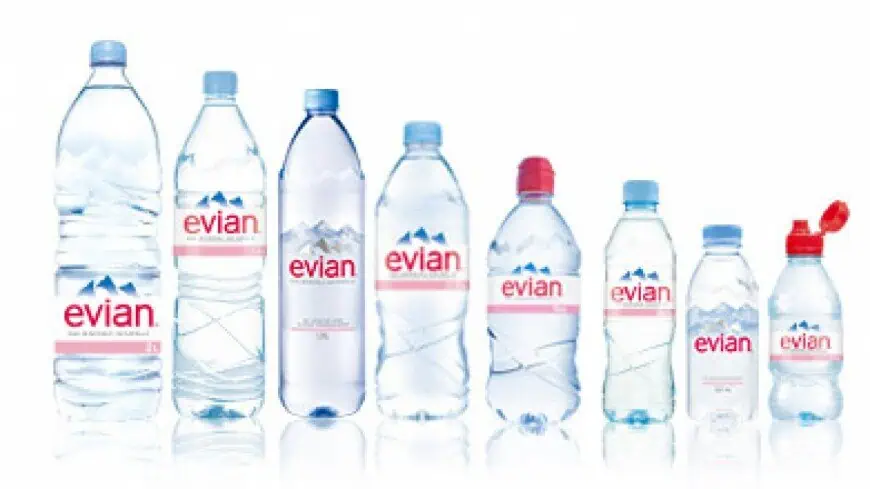
Take for example the visual packaging of Evian products:

There is clearly a thematic link between each product. They are all part of one and the same whole.
Now look at the home page of the Evian website.

Source of images: https://www.evian.com/fr
The website is well and truly part of the Evian company and is naturally integrated as an additional element to its brand identity. The style and the colors have been respected and are prominent. There is also consistency between the visual elements that are used: a photograph of the Evian mountains, and an Evian water bottle. No one will be mistaken: we are at Evian. The language used reflects the brand well.
To be sure that the proposed visual design is the right choice, analyze whether the design represents the brand of the company, as closely and as precisely as possible. If the answer is no, work on another design.
At Bocasay, we are able to fully guide you in the design of your website or web application. Send us a message and find out how we can support you. We have severals development centres : vietnam offshore development centre service or in Madagascar.
What web design standards do I have to meet?
As you may have noticed there are several “standards” that are followed in the majority of websites you find on Google. For example:
- Presence of the logo on the upper left corner.
- Contact button in the right corner.
- Navigation menu is located at the very top of the page.
- Value proposition is at the very top of the page, above the waterline.
- Search function is in the header.
- Call to actions are in the header.
- Breadcrumb for the user to find their way around the site.
- Clicking on the logo takes you back to the home page.
- The icons leading to social networks are in the footer.
In general, adhering with these standards is essential for a successful result. If you want to know more, check out this very well-written article on the subject which also provides some examples of websites that meet these standards. The conclusion is clear. An important point to note is that if you try to violate these standards on your website, it will probably end up being confusing for your users – the bottom line is that most people are used to browsing websites which meet these standards.
What will I use to respect the “rule of thirds”?
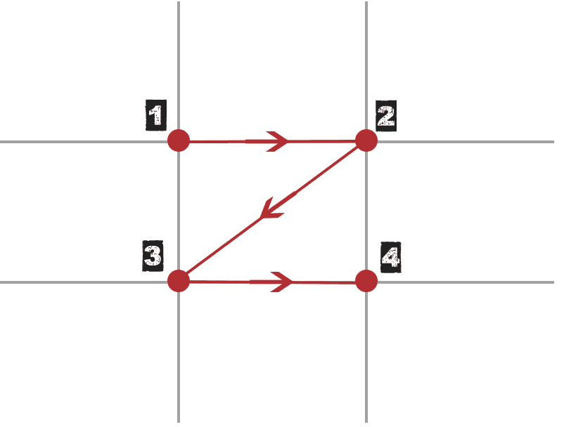
As in photography, in web design it is customary and strongly recommended to use the “rule of thirds”. The rule of thirds divides the design into 9 similarly-sized boxes.
The rule of thirds has been derived from the observation that our eyes have a very precise way of absorbing content and information when they browse an image or a screen.
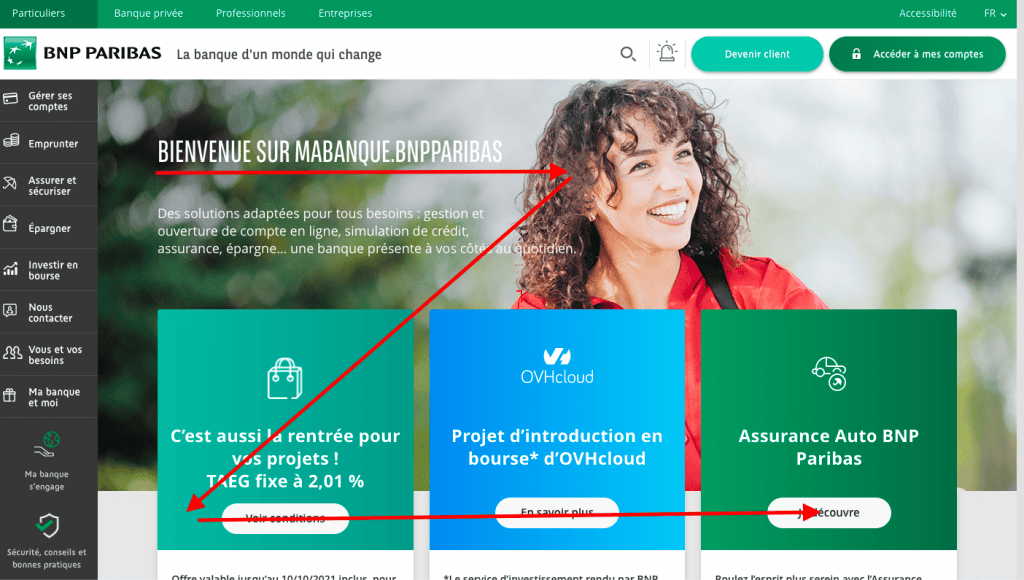
This reading path is a sweep of the area in the form of Z which concerns the 4 points of the drawing below, from point 1 to point 2 to 3 then 2. This Z direction takes place as we read from left to right.

Source: learn-la-photographie.net
With this in mind, you should keep the rule of thirds in mind – and arrange the visual elements in a way that highlights those that are most important to the user. This rule can guide your placement of information on your site.
Let’s look at the home page of the bnpparibas.com site as an example.

The rule also specifies that a visual element should not occupy more than 1/3 of the space, and that the crossings (called “nodes”) are suitable for integrating call-to-actions or important messages.
To put it simply, a visual element should not occupy more than three squares. Nodes are also particularly suitable for placing important messages and calls to action.
If you want to launch an offshore it project for our company, we can help you.
How do I plan for my site’s copywriting and natural referencing?
When designing your website, it’s important to consider the length of the texts you will feature. With natural referencing for good SEO, it is estimated that a page must contain at least 500 words. When it comes to article’s estimates suggest that an optimum length must be at least 1200 words long in order to rank well in search engines.
So, in short, you need to anticipate:
- The length of web copy
- Its readability.
- Its clarity.
Don’t feature overly complicated texts on your site, and don’t get caught up in lengthy sentences. Users tend to have very short attention spans. Assume that users will read diagonally and spot important keywords. So, don’t overload your pages with text.
In general, it’s best to leave this important component of your website to professional web content writers. They will be able to consider the intended user experience and provide copy that is optimized for natural referencing. This will go a long way in maintaining a readable and user-friendly website that makes your users want to stay there and discover more.