Web application design: the impact of colors

Through the intelligent use of colors, it’s possible to communicate specific and considered ideas to your target audience. The study of colors is therefore an important issue to consider when designing your website or web application. Each color has its own impact and addresses a different part of our emotions. Let’s discover what colors convey together in this article.
Depending on the culture, the psychology of colors can vary. If you are targeting a foreign audience, it’s therefore important to educate yourself on the meaning of colors within their cultural contexts. This article will provide a sample of how you can go about understanding colors and their varying impacts.
Colors influence buying decisions
A product’s color can greatly influences the decision to purchase. Take a look at the example below of the “Jolly” brand, which obviously targets women. The choice of packaging colors has been designed to attract and please women who will ideally choose this product over a competitor.
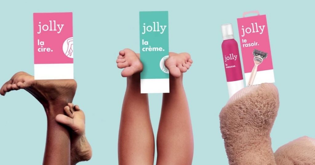
Source: https://www.jolly-depilation.fr/
It’s generally accepted that the process that leads us to decide on the purchase of a product is largely “unconscious”. And this unconscious process is activated (or not) in the first 90 seconds of our encounter with the product. As such, the color is a very important factor that will lead us to act – or not. Another point to consider: ads with color attract twice as much attention as black and white ads.
Warm or cold colors?
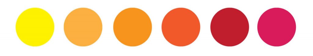
Warm colors
We suggest taking a look at the emotive feels site, which offers a very interesting perspective on the meaning of each color.
Warm colors activate, revive and stimulate. However, you need to be careful to not use them too much in your web or mobile application. Warm colors work great when used in call-to-action (CTA) buttons because they are quick to catch the eye.
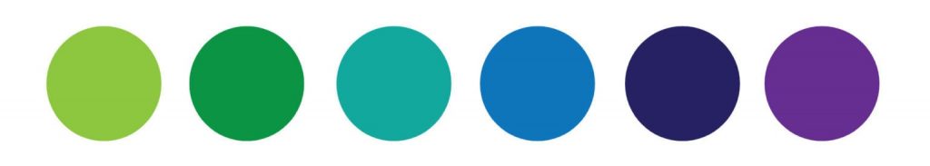
Cold colors
Cold colors, on the other hand, tend to soothe, calm and establish seriousness. Some cool colors may also have characteristics of warm colors.
Source of color palettes: https://www.thenordroom.com/warm-colors-home-fall-decor/
Take the example below of the Banque Populaire home page, where we can clearly see that the dominant tone instils calm, seriousness, confidence and appeasement: a bank of confidence, professionalism, etc.
We can build tech team in Vietnam for your company for your IT needs, contact us.

Source: https://www.bred.fr/
The effect of colors on psychology
Yellow
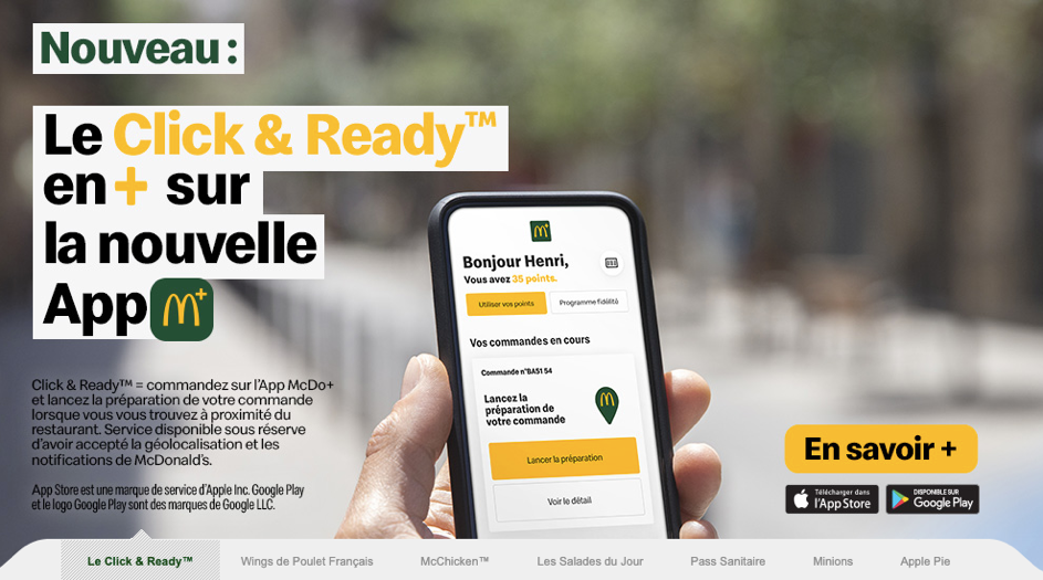
Yellow is one of the first colors we notice in a color palette. Retail or catering companies like to use yellow, as it’s reminiscent of good humor and times – of the sun. Yellow embodies optimism, joy, spring and can stand out particularly well alongside red. It stimulates and awakens leisure time and fun. However, be careful not to overdo it – if overused, it can be disturbing or even irritating. Yellow is also frequently associated with price reductions, discounts.
Consider the use of yellow on the McDonalds homepage: in the catchphrase on the left and in the colored background of the “Learn more” action button.
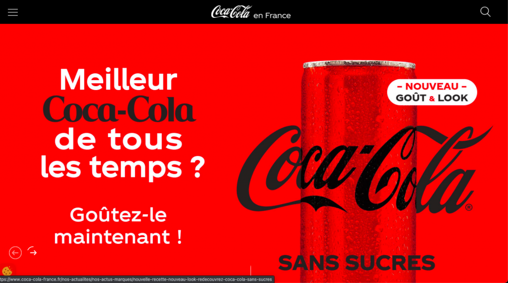
Red
Red represents warmth, power, strength, passion, love, blood, fire. Red can spark passion, action and even violence. Red is very emotionally intense, and is easily distinguished among other colors. That’s why it is widely used on road signs, traffic lights and even on fire trucks. Red can also represent courage. Finally, from a very young age, we have been conditioned to perceive red as an alarm signal or a warning sign of danger.
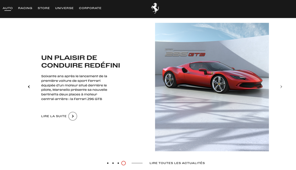
Source: https://www.ferrari.com/fr-FR
Orange
Orange conveys pride, ambition and communication. It is related to the sun, enthusiasm and dynamism. Indeed, orange combines the characteristics of red and yellow. It is used to establish an atmosphere of creativity, stimulation and encouragement. Orange is also associated with autumn, and can be used to connote strength. It is also widely used during the Halloween period. Orange provides a warm effect.
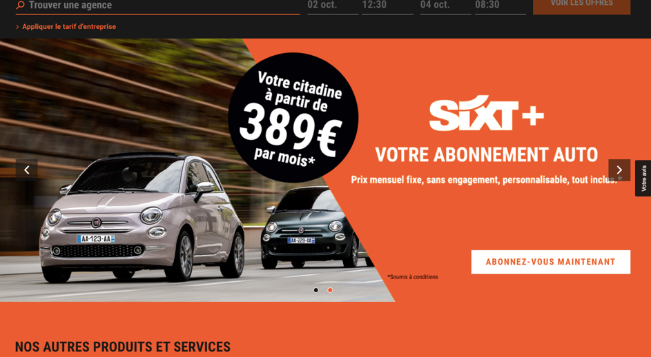
The orange used in the Sixt website conveys the strength and endurance of the brand.
Source: https://www.sixt.fr/#/
Green
Green relates to freshness, ecology, hope, spring, nature… Green is the blend of yellow and blue, and is therfore a balanced color. Green carries both the characteristics of communication and restraint. It soothes, relaxes and helps us rest. Green is healing and truly remains one of the most calming colors for the human eye. Since our childhood, green has been associated with safety: green traffic lights for example. Businesses engaged in the health, wellness, ecology or organic sectors will be well-advised to use green. Green is also easily associated with money and wealth because of US dollars.
Green can also refer to mystery, jealousy, ambition.
As an offshore outsourcing company since 9 years ago, we are able to launch your application project.
Bio C ’Bon food group website:
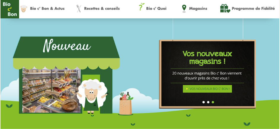
Source https://bio-c-bon.eu/fr
Screenshot from the online sports betting site: Unibet. Green clearly refers to cash here.
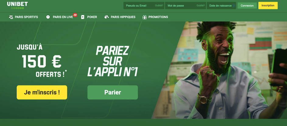
Source: https://unibet.fr/pari-sportif-poker
Pink
Pink is a less intense color. It can evoke gentleness, delicacy, tenderness, eroticism, femininity or even romance. It is also often used to talk about childhood. Some people may view pink as naive, irritating, or even sexist. Innocence and softness are associated with pink.
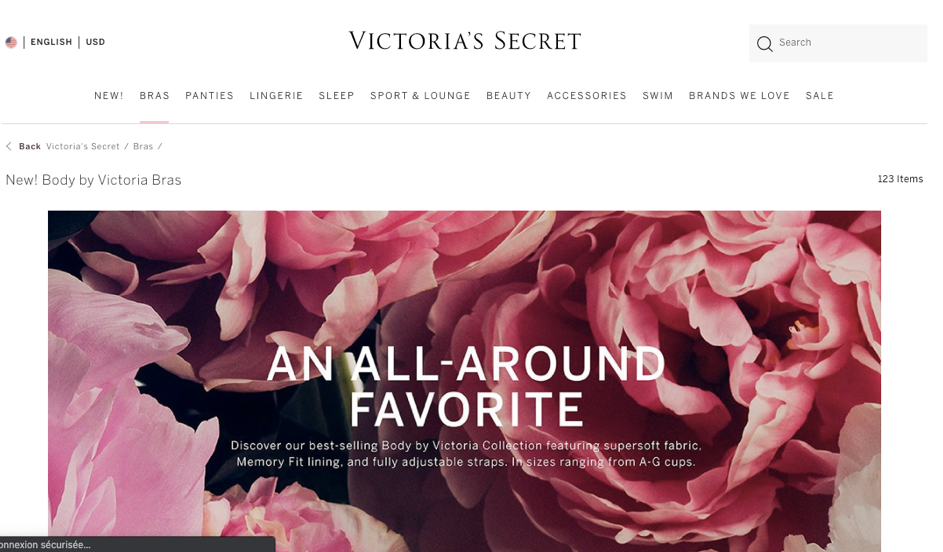
Source: https://www.victoriassecret.com/
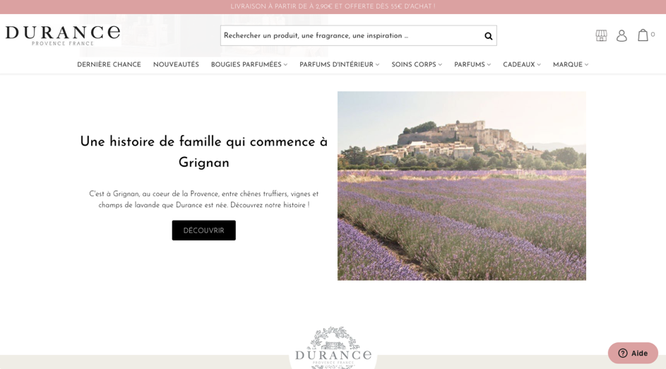
Durance specializes in the manufacture of home fragrances and cosmetic products.
Source: https://www.durance.fr/
Purple
A symbol of royalty, purple represents mystery. Purple is the meeting of the stable character of blue and the energy of red, and is connected with power, luxury and ambition. It is easily associated with wealth and extravagance as well as with magic. Purple is apparently the favorite color of pre-teens. Some may find this color too artificial because it has been seen very little in nature. Deep and even mystical, purple is more refined than blue.
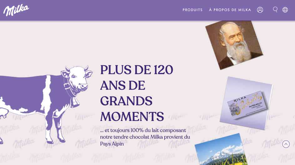
Milka, trademark of chocolate products.
Source: https://www.milka.fr/
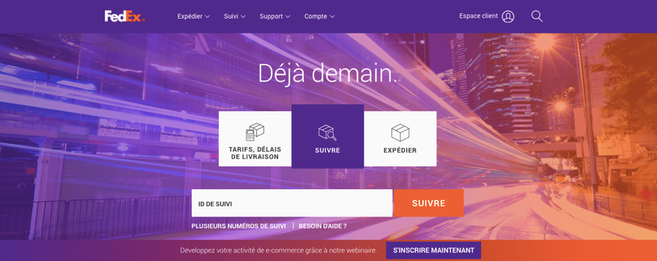
Fedex, an American company and airline specializing in international freight transport.
Source: https://www.fedex.com/fr-fr/home.html
Overall, we would say that the way a color is interpreted and felt really varies from one individual to another. That being said, using these general guidelines, you should be able to refine the general emotional impact of your web design according to your own unique business goals.
If you are looking for a team to support you in the design of your website, mobile application or software, you’ve come to the right place. Send us a message and let’s discuss your project.